Cartier
Reducing checkout friction for Cartier’s one-page purchase journey
Cartier was the first jewellery maison to launch on Farfetch Platform Solutions. Bringing jewellery into a fashion-first platform meant solving a different challenge: making a high-value luxury checkout feel simple, reassuring and effortless while supporting regional payments, personalisation, gifting and complex order scenarios.
From fashion to jewellery
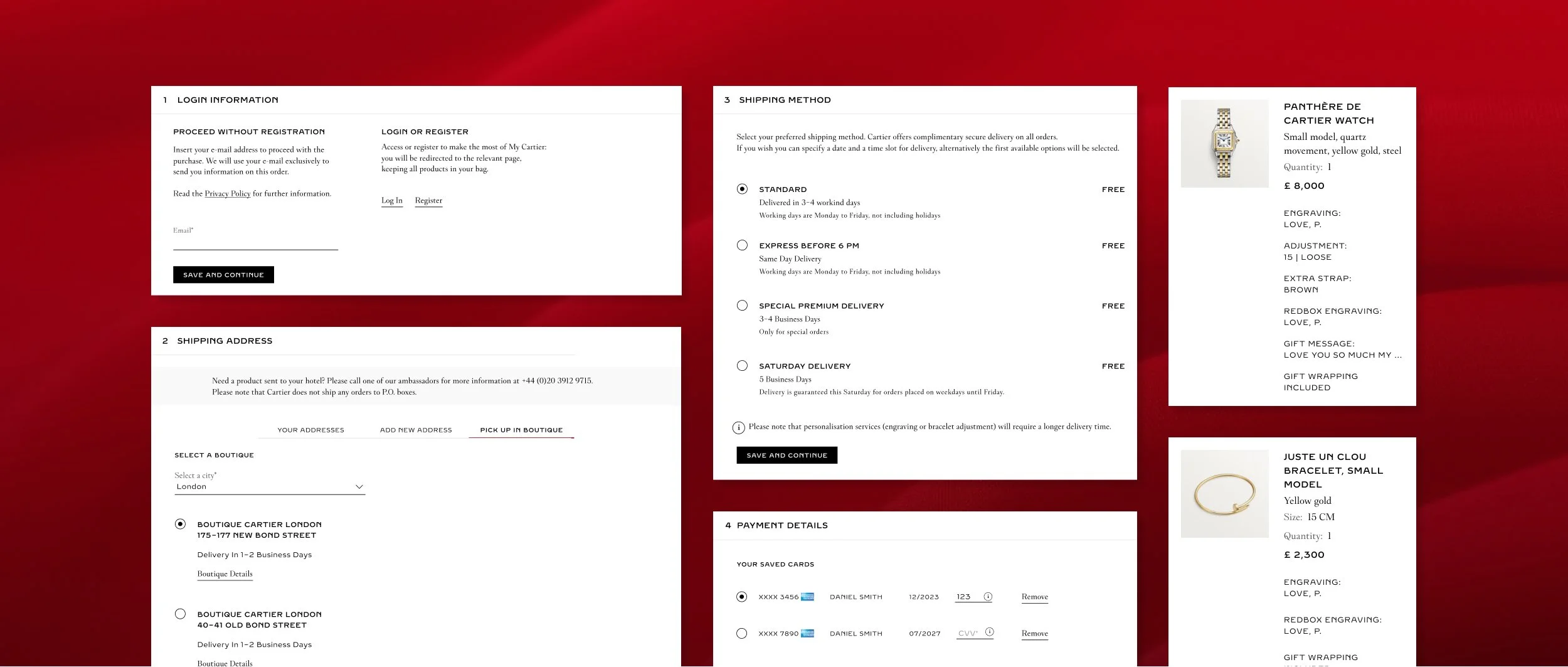
The checkout experience for Cartier introduced requirements that went beyond the platform’s existing fashion-first patterns. Jewellery and watch purchases often carry higher emotional and financial weight and the journey needed to support details such as engraving, sizing, gift messages, gift wrapping and product personalization.
Regional complexity added another layer. Different markets required different payment methods, with some regions supporting up to 15 payment options. The checkout needed to be flexible across these requirements without feeling fragmented or forcing each market into a bespoke design solution.
Making checkout feel seamless
The checkout journey was one of the heaviest parts of the whole Cartier re-platform. I created and maintained around 400 screens, covering regional variations, payment methods, edge cases, product configurations and component states.
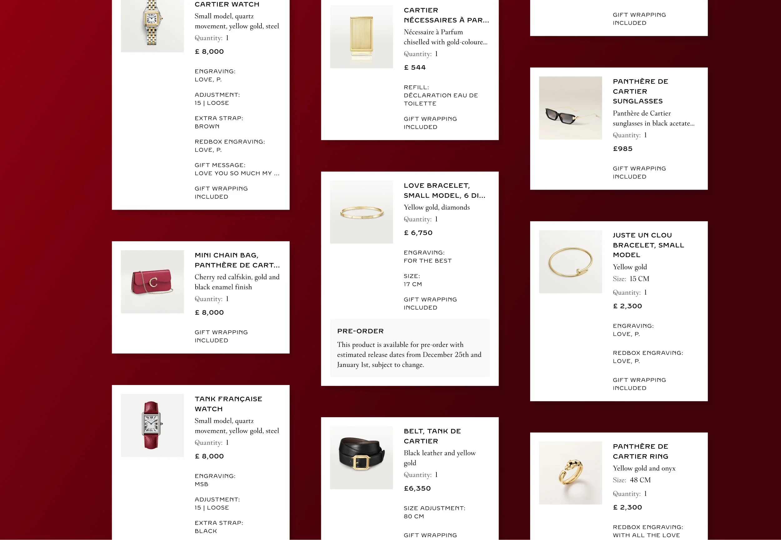
The challenge was not only to design a one-page checkout. It was to make the experience feel calm and easy to complete while the system handled significant complexity in the background. Product cards needed to accommodate personalisation, engraving, gift messages, gift wrapping and other luxury service details. Payment sections needed to adapt by region. Order details needed to remain clear enough for a high-value purchase without overwhelming the customer at the final step.
My design contribution
Owning the initial proposal for the one-page checkout journey, focused on reducing friction at the most commercially critical point in the purchase flow.
Designing scalable checkout components that could adapt across regions, payment methods, product scenarios, and edge cases without needing bespoke flows for each market.
Defining product-card behaviours for personalised items, engraving, gift messages, gift wrapping, and other luxury service details.
Mapping edge cases and component states across the checkout journey to keep the experience consistent across hundreds of screens.
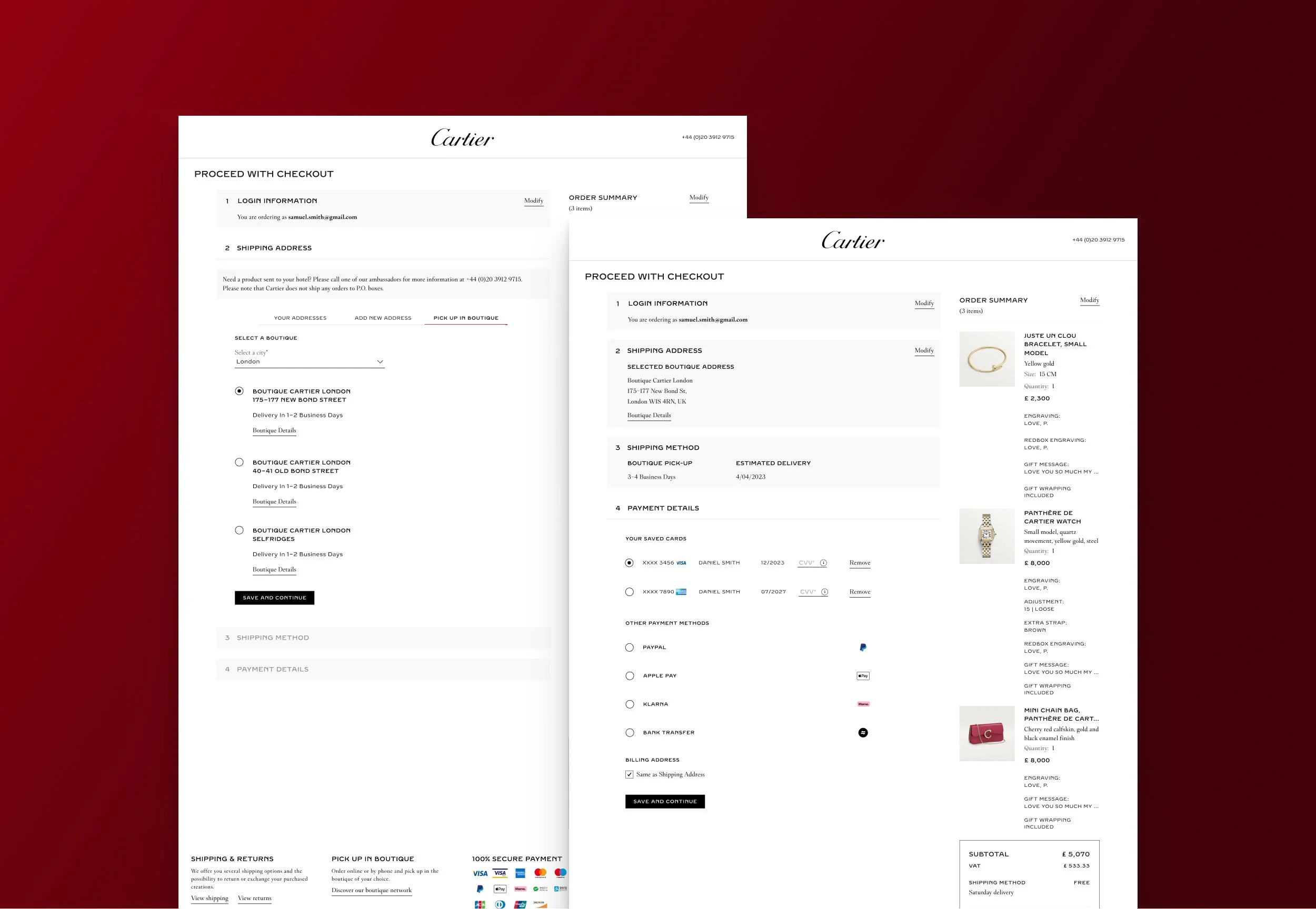
Designing checkout interactions that kept customers oriented and in context, allowing them to review or edit details, understand their progress, and complete the purchase without feeling they might lose information or move backwards.
Partnering closely with product and engineering to balance customer clarity, technical feasibility, delivery constraints, and future platform scalability.
Designing for confidence at the point of purchase
For a luxury purchase, checkout is not just the final step. It is the moment where trust, reassurance, and clarity matter most.
The one-page checkout needed to keep customers within the context of checkout, so they could review or edit previous details without feeling like they might lose progress. This was especially important in a high-value purchase journey, where customers may want to double-check delivery, billing, payment, personalisation or gifting details before committing.
The experience also needed to make progress visible. Users needed to understand how many steps were involved, what had already been completed and what was left before placing the order. The goal was to make checkout feel structured and reassuring, without breaking the flow or sending customers backwards through unnecessary pages.
A key part of the work was deciding where complexity should be visible and where the system should absorb it quietly. The customer did not need to see the operational logic behind every region, product type, or service configuration. They needed a checkout journey that felt organised, predictable and easy to complete.
Building a checkout system beyond one launch
Because Cartier was the first jewellery maison on the platform, many checkout decisions had implications beyond a single launch. Each exception, for example a payment method, a personalised item, a gift option or a regional rule, ccould either become a one-off workaround or part of a more resilient checkout system.
By designing flexible component behaviours rather than isolated screens, the work helped extend what the platform could support for luxury commerce. The goal was to serve Cartier’s immediate launch while creating patterns that could scale to future markets, product categories and partners with similar complexity.
The value of designing through complexity
This project reinforced that reducing friction does not always mean removing steps. Sometimes it means making complexity feel structured, predictable and easy to act on.
The checkout work demanded a high level of detail: mapping edge cases, designing flexible components, aligning with product and engineering, and keeping the customer experience clear across many different scenarios. It was a lesson in designing for scale and in building a system that could handle variation without losing clarity.
Looking back with today’s AI tools
If AI tools had been available at the time, they could have made a significant difference in maintaining the scale of this work. I would have used AI to generate responsive viewport variations, check consistency across hundreds of screens, map edge cases more systematically and most importantly, reduce the manual effort of keeping component states aligned. AI tools could have helped the team move faster while protecting quality across a very complex delivery.