Cidade Matarazzo
Designing the foundations for Cidade Matarazzo’s luxury lifestyle app
Cidade Matarazzo is a luxury lifestyle destination in São Paulo, bringing together hospitality, retail, dining, culture and experiences in one physical space. This work explored how a consumer app could become the digital extension of that ecosystem, connecting fashion, content, commerce and personalised discovery in a way that felt immersive, distinctive and scalable.
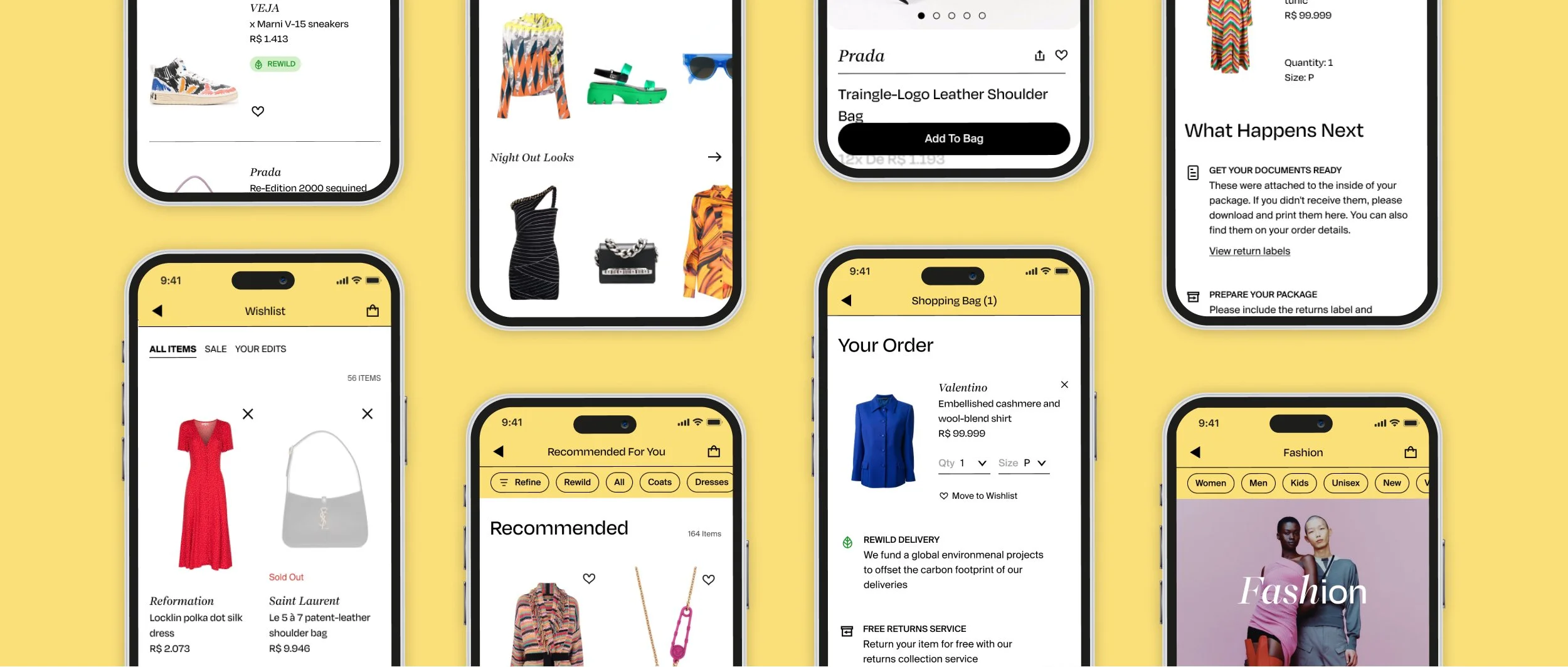
From physical destination to digital ecosystem
The brief was not to design a simple shopping app. Cidade Matarazzo needed a digital experience that could reflect the richness of the physical destination: a place where shopping, hospitality, restaurants, culture and lifestyle would coexist.
I worked alongside the Design Lead as the most senior hands-on designer, helping take the product from 0 to 1 — from early discovery and ambiguous requirements into the first UX/UI foundations for the app. Fashion was the first vertical but the foundations needed to support a much broader ecosystem over time.
Bringing content, commerce and personalisation together
The opportunity was to make the app feel more immersive than traditional luxury e-commerce. Shopping needed to sit alongside editorial content, curated product moments and personalised discovery.
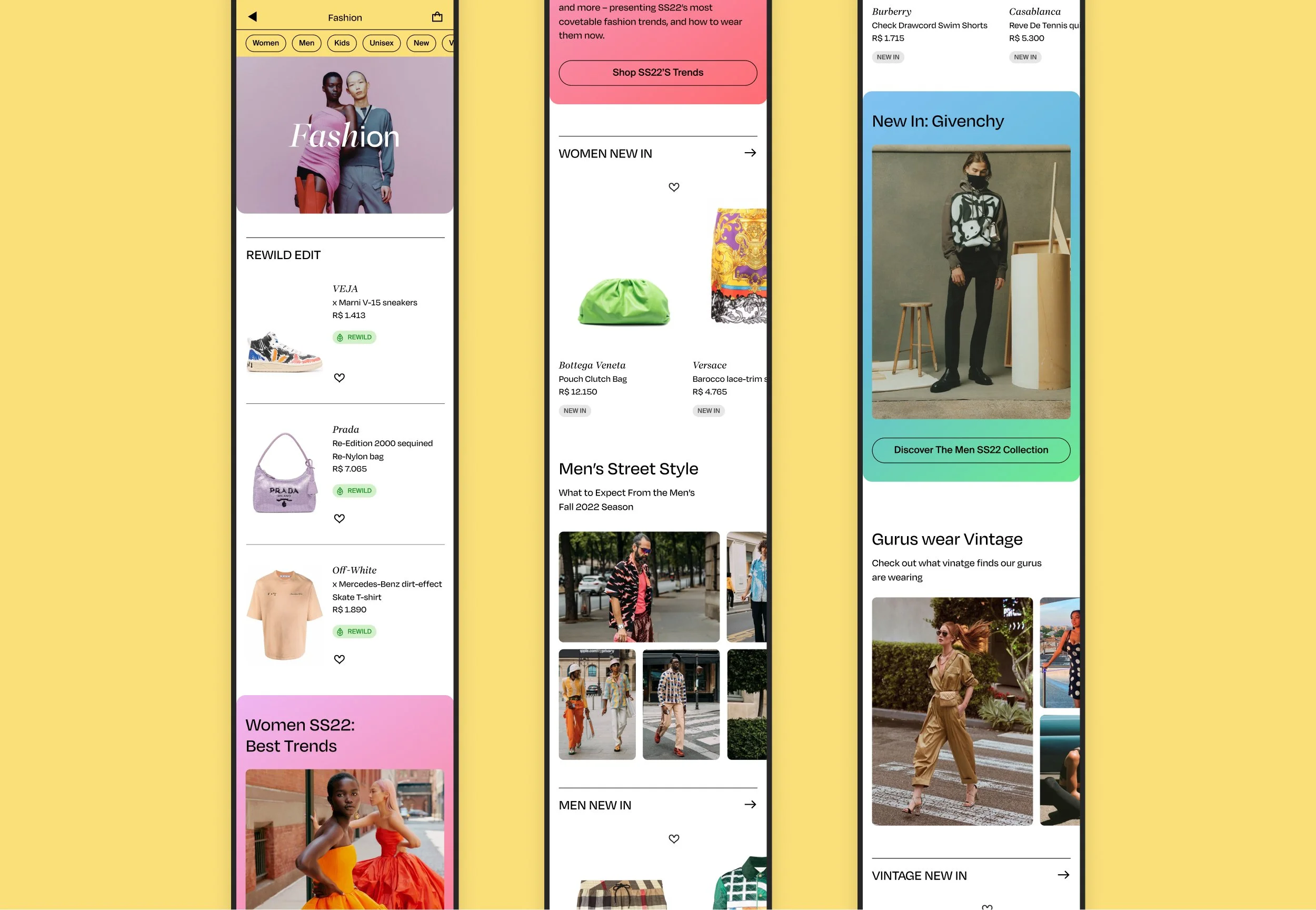
The home experience was designed as an immersive feed, surfacing relevant lifestyle and commerce content for each user based on previous onboarding choices. Tabbed navigation created clear entry points into different verticals, while micro-interactions added moments of warmth and character without distracting from the product experience.
My design contribution
Helping take the product from 0 to 1, translating early discovery, broad client ambitions and evolving requirements into the first UX/UI foundations for the consumer app.
Defining a scalable UI framework, including core interaction patterns, iconography, reusable components and guidance for three other designers working across the product.
Designing the fashion discovery and purchase journeys, connecting editorial content, product discovery and shopping into one experience.
Creating an interactive onboarding flow that welcomed users while capturing preferences for more relevant content and product discovery.
Producing clickable prototypes for client reviews, helping align on key interactions, product direction and experience quality.
Working closely with engineering to validate feasibility, prepare handover files and support implementation.
Turning client ambiguity into tangible design decisions, especially when requirements were broad, evolving or visually led.
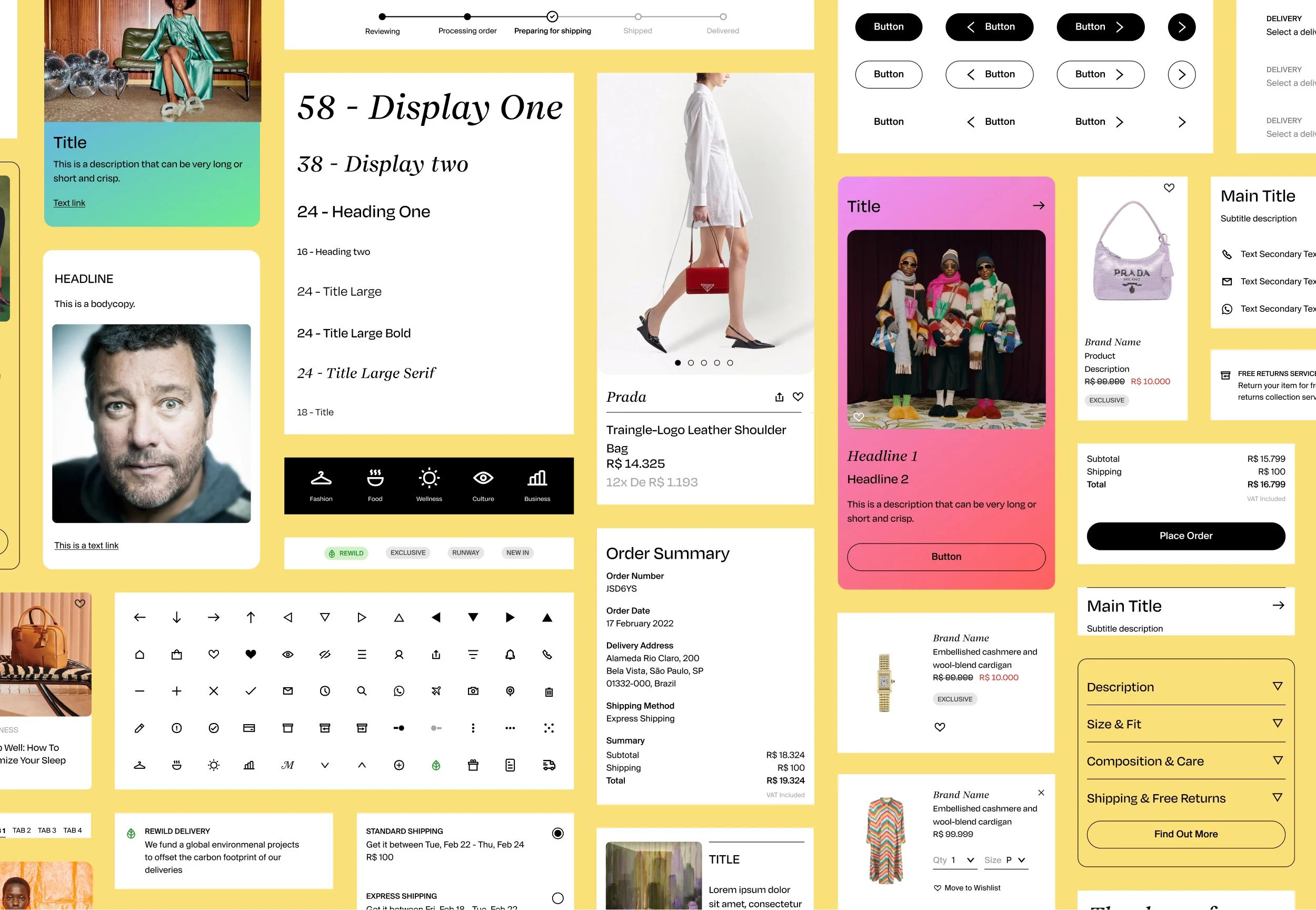
Designing a welcome that set the tone
Because the app was intended to extend a remarkable physical destination, the first interaction needed to do more than onboard users functionally.
The onboarding experience introduced people to the world of Matarazzo while capturing preferences that could shape what they saw next. It helped set the tone for the product: personal, visual and discovery-led from the start.
Making fashion discovery feel more editorial
The fashion journey needed to feel more curated than transactional. With a minimalist and slightly edgy visual direction, product imagery took centre stage, while editorial content added context and inspiration throughout the shopping experience.
Rather than separating content from commerce, the app brought them together through shoppable product cards and editorial moments, helping users move more fluidly between inspiration, discovery and purchase.
Building beyond the first vertical
Although fashion was the initial focus, the foundations needed to support a wider ecosystem of hospitality, dining, culture and services, many of which would connect through external partners later.
This meant creating patterns that could scale beyond the first release: a home feed that could mix different types of content, navigation that could accommodate multiple verticals and a visual system that felt distinctive without becoming too rigid.
Making an ambitious vision tangible
The project brought together a cross-functional team spread across three locations, working on a first-of-its-kind concept within the company. Requirements evolved quickly, the client had a strong visual sensitivity and engineering needed early wireframes before every detail of the product was defined.
My role was to keep momentum while protecting the quality of the experience. Through prototypes, design foundations and close collaboration with engineering, we made the product vision tangible enough for client conversations, internal alignment and future development.
The work also created learnings that were carried into other internal projects, especially around expectation-setting, design handover and reducing friction in cross-functional delivery.
Creating structure before scale
This project reinforced the importance of creating structure before scaling an experience. The visual direction was distinctive but the real design challenge was making sure the foundations were strong enough to support a larger product ecosystem: from onboarding and personalisation to content, commerce and future verticals.
It also reminded me how important it is to align ambition with product reality early. The client vision was exciting but not always clearly defined. Some expectations needed stronger product and commercial framing sooner. If I could revisit one thing, I would have pushed for more direct user research locally to better understand the culture, behaviours and expectations of the people this experience was ultimately designed for.
Looking back with today’s AI tools
If AI tools had been available they would have helped me to move faster towards alignment. AI could have reduced the manual effort of keeping a 0-to-1 design system coherent as more designers and use cases were added to the project. In addition, I would use AI tools to document and syntethise client input, exploring more interaction directions and test how the design system would scale across future verticals.